About that UKIP number
About that UKIP number
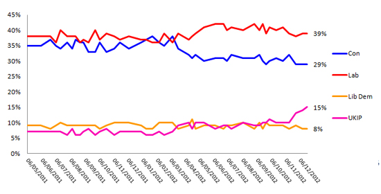
The major difference between polls taken at the start of 2012 and at the start of 2013 is that the UKIP share of the vote has gone from around 7% to just about double that.
In that time, UKIP have regularly scored higher than the Liberal Democrats in the polls and came in second place in by-elections in Rotherham and Middlesbrough.
The chart below shows all published Opinium polls going back to mid 2011 and the purple line experiences two significant rises; one around the time of the 2012 budget, coinciding with a drop in the blue line, the other in the last few weeks of 2012, this time less clearly related to a drop in Conservative support.

The final Opinium/Observer poll of 2012 showed UKIP on 15% and while UKIP have also seen their numbers rise in polls by many other firms (helpfully collected here), our figure is definitely at the higher end of that spectrum. It seems like a good time therefore to look at what is, and what is not, causing this shift.
Why is Opinium?s number higher than some others?
We?d hope it?s because our number is the correct one but the main reason could be that we do not weight results by party ID or past vote. While we weight all results to nationally representative figures (such as the proportion of men and women in the population), we do not make sure that the number of people in the sample who say they voted for a particular party in 2010 matches the actual election result.
Whatever the virtues or drawbacks of this approach, it is possible that weighting to these factors (such as the UKIP?s 3.1% share of the vote in the 2010 election) may be pulling UKIP?s numbers for other firms below the more ?raw? figures produced by Opinium.
How do we present our voting intent question to respondents?
The other thing to point out is that Opinium does not include UKIP in its initial voting intent question and only shows the party as an option if a respondent selects ?some other party?. (This is a little clearer in the data tables here with V1 being the first question and V2 the second).
This setup has not changed at all in the last two years so UKIP?s recent increase is independent of any methodology changes. There is a debate to be had about whether to present all options upfront (as they would be presented on a ballot paper) or separate them in the way that Opinium and most other companies present the options, but we feel confident that the current method of initially presenting respondents with the three main political parties and an ?other? option, will produce the most accurate results.
This is also a fairly consistent result for UKIP. Even the most recent surge is not an isolated spike in the chart but has been seen in the last three surveys covering a period of around six weeks.
While it?s fair to be distrustful of polls conducted over the Christmas period (when lots of people will hopefully have better things to do than fill out surveys), for all three results to be outliers then respondents would have had to take the whole of December off.
Our approach when UKIP first overtook the Lib Dems in April 2012 was ?wait and see? and while we have added UKIP to the voting intention tracker chart, ?wait and see? is the approach we?re going to take for the near future.


